CSS Course
It is a 2-dimensional system, meaning it can handle both columns and rows, unlike Flex Box which is largely a 1-dimensional system.
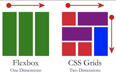
We will work with Grid Layout by applying CSS rules both to a parent element (which becomes the Grid Container) and to that element's children (which become Grid Items).
Grid Container
The element on which display: grid is applied. It's the direct parent of all the grid items. In this example container is the grid container.
Grid containers consist of grid items, placed inside columns and rows.
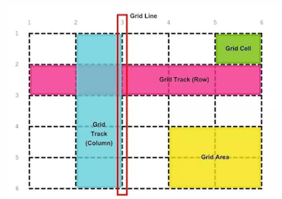
Grid Line
The dividing lines that make up the structure of the grid. They can be either vertical (column grid lines) or horizontal (row grid lines) and reside on either side of a row or column. Here the red line is an example of a column grid line.
Grid Track
The space between two adjacent grid lines. You can think of them like the columns or rows of the grid. Here's the grid track between the second and third row grid lines.
Grid Area
The total space surrounded by four grid lines. A grid area may be composed of any number of grid cells. Here's the grid area between row grid lines 1 and 3, and column grid lines 1 and 3.
Grid Item
The children (i.e. direct descendants) of the grid container. Here the item elements are grid items, but sub-item isn't.
Grid Cell
The space between two adjacent row and two adjacent column grid lines. It's a single unit of the grid. Here's the grid cell between row grid lines 1 and 2, and column grid lines 2 and 3.
Properties for the Parent (Grid Container)
-
display Defines the element as a grid container and establishes a new grid formatting context for its contents display: grid (or) inline-grid;
-
grid-template-columns and grid-template-rows Defines the columns and rows of the grid with a space-separated list of values. The values represent the track size, and the space between them represents the grid line.
grid-template-columns: [first] 40px [line2] 50px [line3] auto [col4-start] 50px [five] 40px [end]; grid-template-rows: [row1-start] 25% [row1-end] 100px [third-line] auto [last-line];
-
grid-template-areas Defines a grid template by referencing the names of the grid areas which are specified with the grid-area property. Repeating the name of a grid area causes the content to span those cells. A period signifies an empty cell. The syntax itself provides a visualization of the structure of the grid.
grid-template-areas: "header header header header" "main main . sidebar" "footer footer footer footer";
-
grid-template A shorthand for setting grid-template-rows, grid-template-columns, and grid-template-areas in a single declaration.
grid-template: none (or) <grid-template-rows> (or) <grid-template-columns>;
grid-template: [row1-start] "header header header" 25px [row1-end] [row2-start] "footer footer footer" 25px [row2-end] / auto 50px auto;
-
column-gap, row-gap, grid-column-gap and grid-row-gap Specifies the size of the grid lines. You can think of it like setting the width of the gutters between the columns/rows.
/_ standard _/ column-gap: <line-size>; row-gap: <line-size>;
/_ old _/ grid-column-gap: <line-size>; grid-row-gap: <line-size>;
- gap and grid-gap A shorthand for row-gap and column-gap /_ standard _/ gap: <grid-row-gap> <grid-column-gap>;
/_ old _/ grid-gap: <grid-row-gap> <grid-column-gap>;
-
justify-items Aligns grid items along the inline (row) axis (as opposed to align-items which aligns along the block (column) axis). This value applies to all grid items inside the container.
justify-items: start (or) end (or) center (or) stretch;
-
align-items Aligns grid items along the block (column) axis (as opposed to justify-items which aligns along the inline (row) axis). This value applies to all grid items inside the container.
align-items: start (or) end (or) center (or) stretch;
-
place-items place-items sets both the align-items and justify-items properties in a single declaration.
Values:
<align-items> (or) <justify-items> The first value sets align-items, the second value justify-items. If the second value is omitted, the first value is assigned to both properties.
-
justify-content Sometimes the total size of your grid might be less than the size of its grid container. This could happen if all of your grid items are sized with non-flexible units like px. In this case you can set the alignment of the grid within the grid container. This property aligns the grid along the inline (row) axis (as opposed to align-content which aligns the grid along the block (column) axis).
justify-content: start (or) end (or) center (or) stretch (or) space-around (or) space-between (or) space-evenly;
-
align-content Sometimes the total size of your grid might be less than the size of its grid container. This could happen if all of your grid items are sized with non-flexible units like px. In this case you can set the alignment of the grid within the grid container. This property aligns the grid along the block (column) axis (as opposed to justify-content which aligns the grid along the inline (row) axis).
align-content: start (or) end (or) center (or) stretch (or) space-around (or) space-between (or) space-evenly;
-
place-content place-content sets both the align-content and justify-content properties in a single declaration.
Values:
<align-content> (or) <justify-content> The first value sets align-content, the second value justify-content. If the second value is omitted, the first value is assigned to both properties.
-
grid-auto-columns and grid-auto-rows Specifies the size of any auto-generated grid tracks (aka implicit grid tracks). Implicit tracks get created when there are more grid items than cells in the grid or when a grid item is placed outside of the explicit grid.
grid-auto-columns: <track-size> ...; grid-auto-rows: <track-size> ...;
-
grid-auto-flow If you have grid items that you don't explicitly place on the grid, the auto-placement algorithm kicks in to automatically place the items. This property controls how the auto-placement algorithm works.
grid-auto-flow: row (or) column (or) row dense (or) column dense;
-
grid A shorthand for setting all of the following properties in a single declaration: grid-template-rows, grid-template-columns, grid-template-areas, grid-auto-rows, grid-auto-columns, and grid-auto-flow (Note: You can only specify the explicit or the implicit grid properties in a single grid declaration).
grid: [row1-start] "header header header" 1fr [row1-end] [row2-start] "footer footer footer" 25px [row2-end] / auto 50px auto;
Properties for the Children(Grid Items)
-
grid-column-start, grid-column-end, grid-row-start,grid-row-end Determines a grid item's location within the grid by referring to specific grid lines. grid-column-start/grid-row-start is the line where the item begins, and grid-column-end/grid-row-end is the line where the item ends.
-
grid-column and grid-row Shorthand for grid-column-start + grid-column-end, and grid-row-start + grid-row-end, respectively.
-
grid-area Gives an item a name so that it can be referenced by a template created with the grid-template-areas property. Alternatively, this property can be used as an even shorter shorthand for grid-row-start
- grid-column-start + grid-row-end + grid-column-end.
grid-area: <name> (or) <row-start> (or) <column-start> (or) <row-end> (or) <column-end>;
-
justify-self Aligns a grid item inside a cell along the inline (row) axis (as opposed to align-self which aligns along the block (column) axis). This value applies to a grid item inside a single cell.
justify-self: start (or) end (or) center (or) stretch;
-
align-self Aligns a grid item inside a cell along the block (column) axis (as opposed to justify-self which aligns along the inline (row) axis). This value applies to the content inside a single grid item.
align-self: start (or) end (or) center (or) stretch;
-
place-self place-self sets both the align-self and justify-self properties in a single declaration. place-self: center; place-self: center stretch;
HTML
<h2>CSS Grid using display grid property</h2>
<div class="grid-container1">
  <div class="grid-item grid-item-1">Grid Item 1</div>
  <div class="grid-item grid-item-2">Grid Item 2</div>
  <div class="grid-item grid-item-3">Grid Item 3</div>
</div>

<h2>CSS Grid using grid-template-columns property</h2>
<div class="grid-container2">
  <div class="grid-item grid-item-1">Grid Item 1</div>
  <div class="grid-item grid-item-2">Grid Item 2</div>
  <div class="grid-item grid-item-3">Grid Item 3</div>
  <div class="grid-item grid-item-4">Grid Item 4</div>
  <div class="grid-item grid-item-5">Grid Item 5</div>
  <div class="grid-item grid-item-6">Grid Item 6</div>
</div>

<h2>CSS Grid using grid-template-rows property</h2>
<div class="grid-container3">
  <div class="grid-item grid-item-1">Grid Item 1</div>
  <div class="grid-item grid-item-2">Grid Item 2</div>
  <div class="grid-item grid-item-3">Grid Item 3</div>
</div>

<h2>CSS Grid using grid-auto-columns property with grid-area property</h2>
<div class="grid-container4">
  <div class="grid-item grid-area-1">Grid Item 1</div>
  <div class="grid-item grid-area-2">Grid Item 2</div>
  <div class="grid-item grid-area-3">Grid Item 3</div>
  <div class="grid-item grid-area-4">Grid Item 4</div>
  <div class="grid-item grid-area-5">Grid Item 5</div>
  <div class="grid-item grid-area-6">Grid Item 6</div>
</div>

<h2>
  CSS Grid using grid-auto-rows property with grid-template-columns property
</h2>
<div class="grid-container5">
  <div class="grid-item">Grid Item 1</div>
  <div class="grid-item">Grid Item 2</div>
  <div class="grid-item">Grid Item 3</div>
  <div class="grid-item">Grid Item 4</div>
  <div class="grid-item">Grid Item 5</div>
  <div class="grid-item">Grid Item 6</div>
</div>

<h2>CSS Grid using grid-gap property</h2>
<div class="grid-container6">
  <div class="grid-item">Grid Item 1</div>
  <div class="grid-item">Grid Item 2</div>
  <div class="grid-item">Grid Item 3</div>
  <div class="grid-item">Grid Item 4</div>
  <div class="grid-item">Grid Item 5</div>
  <div class="grid-item">Grid Item 6</div>
</div>

<h2>CSS Grid using grid-template-areas property</h2>
<div class="grid-container7">
  <div class="grid-item grid-item7-1">Header</div>
  <div class="grid-item grid-item7-2">Nav</div>
  <div class="grid-item grid-item7-3">Content</div>
  <div class="grid-item grid-item7-4">Aside</div>
  <div class="grid-item grid-item7-5">Footer</div>
</div>

<h2>CSS Grid using place-content property</h2>
<div class="grid-container8">
  <div class="grid-item">Grid Item 1</div>
  <div class="grid-item">Grid Item 2</div>
  <div class="grid-item">Grid Item 3</div>
  <div class="grid-item">Grid Item 4</div>
  <div class="grid-item">Grid Item 5</div>
  <div class="grid-item">Grid Item 6</div>
</div>

<h2>CSS Grid using grid-column property</h2>
<div class="grid-container8">
  <div class="grid-item grid-item9-1">Grid Item 1</div>
  <div class="grid-item grid-item9-2">Grid Item 2</div>
  <div class="grid-item grid-item9-3">Grid Item 3</div>
  <div class="grid-item grid-item9-4">Grid Item 4</div>
  <div class="grid-item grid-item9-5">Grid Item 5</div>
</div>

<h2>CSS Grid using grid-row property</h2>
<div class="grid-container8">
  <div class="grid-item grid-item10-1">Grid Item 1</div>
  <div class="grid-item grid-item10-2">Grid Item 2</div>
  <div class="grid-item grid-item10-3">Grid Item 3</div>
  <div class="grid-item grid-item10-4">Grid Item 4</div>
  <div class="grid-item grid-item10-5">Grid Item 5</div>
</div>
CSS
body {
  padding: 10px;
  font-weight: bold;
}
.grid-container1 {
  display: grid;
}

.grid-item {
  border: 20px solid darkred;
  padding: 10px;
  font-size: 40px;
}

.grid-container2 {
  display: grid;
  grid-template-columns: 1fr 1fr 1fr;
}

.grid-container3 {
  display: grid;
  grid-template-rows: 1fr 1fr 1fr;
}

.grid-container4 {
  display: grid;
  grid-auto-columns: 150px;
}
.grid-area-1 {
  grid-area: 1 / 1 / 2 / 2;
}
.grid-area-2 {
  grid-area: 1 / 2 / 2 / 3;
}
.grid-area-3 {
  grid-area: 1 / 3 / 2 / 4;
}
.grid-area-4 {
  grid-area: 2 / 1 / 3 / 2;
}
.grid-area-5 {
  grid-area: 2 / 2 / 3 / 3;
}
.grid-area-6 {
  grid-area: 2 / 3 / 3 / 4;
}

.grid-container5 {
  display: grid;
  grid-template-columns: 200px 250px;
  grid-auto-rows: minmax(150px, auto);
}

.grid-container6 {
  display: grid;
  grid-template-columns: 200px 250px;
  grid-auto-rows: minmax(150px, auto);
  grid-gap: 20px;
}

.grid-container7 {
  display: grid;
  grid-template-areas:
    "header header header header header header"
    "nav contents contents contents contents aside"
    "footer footer footer footer footer footer";
  grid-gap: 10px;
}

.grid-item7-1 {
  grid-area: header;
}
.grid-item7-2 {
  grid-area: nav;
}
.grid-item7-3 {
  grid-area: contents;
}
.grid-item7-4 {
  grid-area: aside;
}
.grid-item7-5 {
  grid-area: footer;
}

.grid-container8 {
  display: grid;
  grid-gap: 10px;
  grid-template-columns: 200px 250px;
  grid-auto-rows: minmax(150px, auto);
  place-content: center;
}

.grid-item9-1 {
  grid-column: 1 / span 2;
}

.grid-item10-1 {
  grid-row: 1 / span 2;
}

.grid-item11-2 {
  place-self: center;
}
You can check out the Demo.