CSS Course
The term responsive design was coined by Ethan Marcotte in 2010 to describe the use of three techniques in combination.
What Is Responsive Web Design?
Responsive web design is an approach that suggests that design and development should respond to the user's behavior and environment based on screen size, platform, and orientation.
The practice consists of a mix of flexible grids and layouts, images, and an intelligent use of CSS media queries. As the user switches from their laptop to an iPad, the website should automatically switch to accommodate for resolution, image size, and scripting abilities.
One may also have to consider the settings on their devices; if they have a VPN for iOS on their iPad, for example, the website should not block the user's access to the page.
In other words, the website should have the technology to automatically respond to the user's preferences.
This would eliminate the need for a different design and development phase for each new gadget on the market.
Animated GIF of responsive design working

Tools for Responsive Web Design
What is a media query?
A media query is a CSS technique introduced in CSS3.
It uses the @media rule to include a block of CSS properties only if a certain condition is true.
For example,If the browser window is 600px or smaller, the background color will be lightblue:
@media only screen and (max-width: 600px) {
  body {
    background-color: lightblue;
  }
}
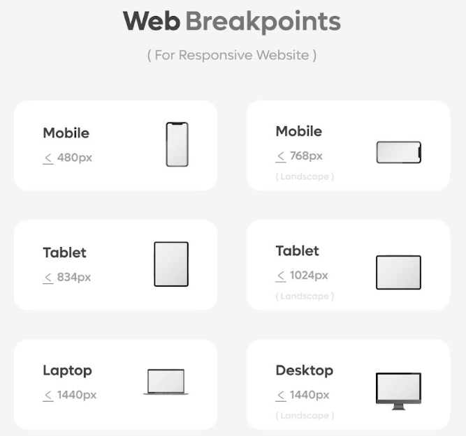
Media queries can help with that. We can add a breakpoint where certain parts of the design will behave differently on each side of the breakpoint.
Desktop

Phone

Here with the responsive web design with important breakpoints.